David Carson
David Carson
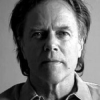
David Carsonis an American graphic designer, art director and surfer. He is best known for his innovative magazine design, and use of experimental typography. He was the art director for the magazine Ray Gun, in which he employed much of the typographic and layout style for which he is known. In particular, his widely imitated aesthetic defined the so-called "grunge typography" era...
NationalityAmerican
ProfessionDesigner
Date of Birth8 September 1954
CountryUnited States of America
Never mistake legibility for communication.
You'll see everything from gold teeth to hood ornaments. It's almost like Halloween during August.
The station was tight, aggressive ... the deejays at times sounding as if they were broadcasting at gunpoint.
Don't confuse legibility with communication.
For some reason I have a visual intuition that allows me to design things in an interesting way, and I don't know where that came from. Because I don't have this formal training, I seem to drift in a different direction.
If you have no intuitive sense of design, then call yourself an "information architect" and only use Helvetica.
It's not about knowing all the gimmicks and photo tricks. If you haven't got the eye, no program will give it to you.
Graphic design will save the world right after rock and roll does.
You have to utilize who you are in your work. Nobody else can do that: nobody else can pull from your background, from your parents, your upbringing, your whole life experience.
Invite the reader to participate by deciphering. Chaos can attract and engage.
Dont confuse legibility with communication. Just because something is legible doesnt mean it communicates and, more importantly, doesnt mean it communicates the right thing.
He was sort of an inventor of a tough-guy look, whether he knew it or not.
Must See TV' is a snore. 'Must Stream TV' is where the action is—where Adult Swim meets the X Box. Nowhere but Heavy.com will you find a full new season of fall original programming—humorous, outrageous programming that TV can't do. Broadband is poised to overtake cable audiences and America is ready for breakthrough shows like Dr. Philpra, Colossus Whisperer.
There's no other time in the year where commercials can take center stage. Commercials are always the things that are playing when you're going to the bathroom or grabbing a soda from the fridge.